
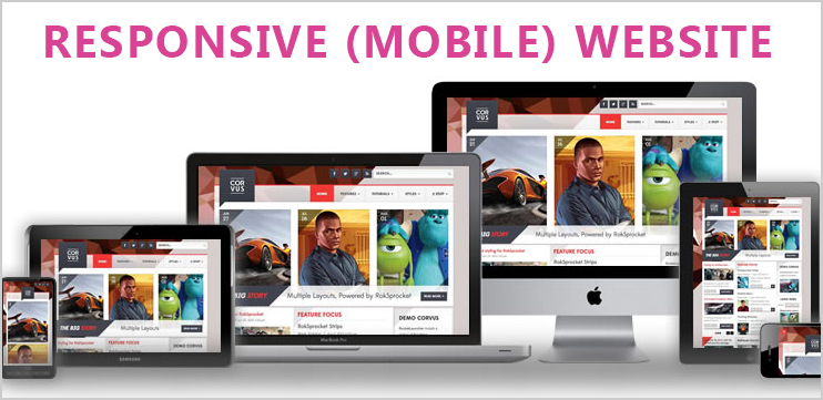
MOBILE (RESPONSIVE) WEBSITES
A BEAUTIFUL EXPERIENCE THAT CAN BE ACCESSED FROM ALL DEVICES.
In today’s Multi-Device world when most Internet Browsing is happening through Smart Phones, if you do not have a Responsive Website that can be accessed from any Devise, you are likely to lose the battle for mind, market and wallet share.
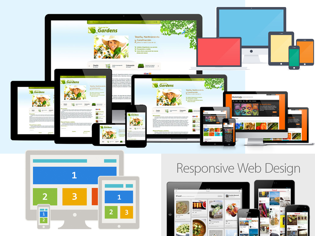
WHAT IS RESPONSIVE WEB DESIGN?
When a Website is designed and developed, the display qualities is rendered to a full screen monitor of a PC, which when viewed on a screen of different size or resolution needs readjustment by the user. To reduce the consequences of losing Visitors or Prospective Clients, Web Designers and Developers have devised a method by using the CSS that will automatically adjust Webpage Layouts for optimal content display for any screen size or resolution.
We design Intelligent Websites that respond to the size and shape of your customers’ Internet-capable devices, including: Desktops, Laptops, IPhones, IPads, Androids, and Tablets.
K3 Web Creation offers very cost Effective Mobile Design Services. All the Mobile Designs created will be in par with International Standards. Regardless of whether you are targeting local market or global market we will be able to create The Best Mobile Designs for your Website.
MOBILE WEB DESIGN – HOW IT WORKS?
THE SAME SITE, BUT SMALLER
If you want your site to fit in your pocket, it should be tailored to fit. A Responsive Web Design is the best fit for most Websites. However, in unique situations, when the user goals and content are strategically different on a Mobile Device, the best solution is to produce a separate Mobile Presence.
If you build one site for full-size users and another for Mobile Devices, the site can automatically detect how your visitor is seeing the site, and then send them to the correct version. Mobile Web Design is about building another version of your site by adapting the design, content, and features.DESIGN FOR MOBILE
A Mobile Device has about one tenth as many pixels as a regular screen. And since form follows function, the Mobile Site needs its own design. The Design should be simpler.
Here are a few ways that the design of the Mobile Site can be adapted:
- Use a one-column layout.
- Use fewer graphics, save screen space and load time.
- Use simpler navigation, so there is more room for larger buttons.
CONTENT FOR SMALL SCREENS
If writing for Websites is about being brief and to-the-point, writing for Mobile Sites is even more so. If visitors are unlikely to read a large blocky paragraph on a big screen, they're even less likely to read it on the tiny screen in their hand.
Shorten your copy. Turn your sections into single pages. Turn your paragraphs into sentences. Edit, then edit again. Be brief.
Fortunately, Managing the Content on your Mobile Site is easy. Good Content Management Tools can manage Website content for both screens, big and small, from one place.
K3 Web Creation has expertise in providing range of Responsive Web Design Solutions and Responsive Web Design Services.
MOBILE APPS OR MOBILE SITE
Apps are good for specific tasks, but generally mobile sites are more effective for small businesses.
Mobile App is a Mobile Specific Website, designed for use on Mobile Devices; it is normally more simple and direct.
WHY CHOOSE US?
K3 Web Creation is a Professional yet friendly Web Design and Web Development Company which has been serving its customers since 2009 with the highest level of commitment. We work closely with our customers and we try to establish mutually rewarding long term relationship. You will certainly not be disappointed in choosing K3 Web Creation for all your Mobile Design needs.
We have…
- Experienced resources in various responsive web development technologies.
- Knowledge of various tools and techniques for testing final product.
- Quality services at very reasonable cost.
- Transparent policies for smooth transactions.
- K3 Web Creation guarantees 100% satisfaction to customers by offering Cutting-Edge Mobile Design Services. We will be able to deliver you with Impressive Mobile Designs and help you target the fastest growing segment of your customer base effectively.
- K3 Web Creation specializes in the creation of Responsive Websites that are Unique, Aesthetically-Attractive and Functionally Top-Class.
MOBILE (RESPONSIVE) WEBSITES