Newsletter Designing

The Email Newsletter is a powerful Marketing and Communication Tool that has various useful functions. It reminds your users about you; it informs users about your products; it tells them what you have been up to; and it helps you build a unique relationship with them.
Users like Email Newsletters if the Newsletters bring them value. The fundamental rule for creating an Email Newsletter is to give it interesting, relevant and up-to-date information that is enjoyable to read.
One way to encourage users to open your Newsletter is to write a subject line that grabs their attention.
A Newsletter should contain information that users would not normally research on their own. Users take seconds to scan for topics of interest to them before deciding whether to spend more time reading the Newsletter.
We at K3 Web Creation make sure the rewards are relevant to your product and target audience. which gives out a free blusher to customers who shop via its Newsletter.
We Design your Newsletter to suit its chief purpose. If the main objective is to announce a new product or promote a particular service, you may want to focus the Newsletter entirely on this product or service.
If your Newsletter, shows only one or two topics, users would less likely to find something of interest to them.
We make your Newsletter’s Content as relevant to your readers as possible, whether through offers, products or images. You could always offer subscribers special deals or freebies.
Studies says that the average reader skims a newsletter for 51 seconds. People never read: they scan for content that is of interest to them. So, we don’t overwhelm them by squeezing too much information on the page.
We at K3 Web Creation make sure your content gets straight to the point, and write short paragraphs and bullet points.
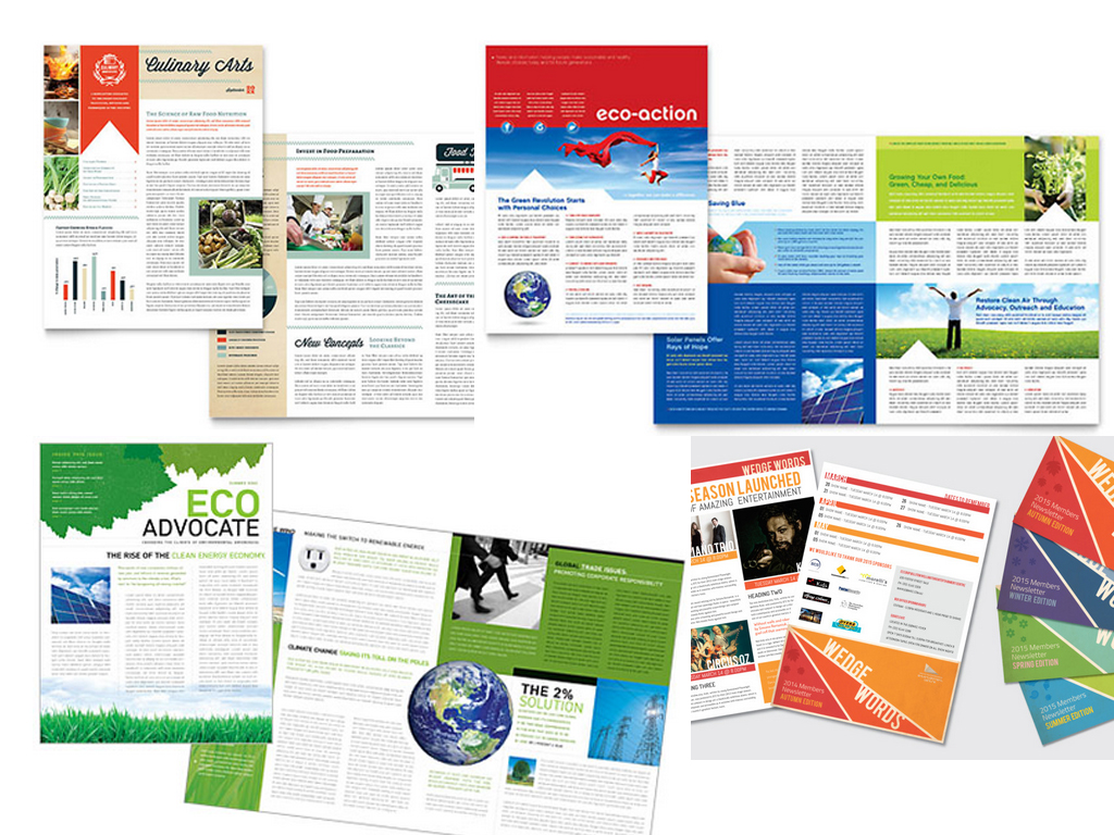
A Newsletter can be designed in a one-column or multi-column layout or a mixture of both. A one-column grid is easier to skim but might take up more space and increase the length of the Newsletter.
A two-column layout is common for Newsletters. Narrower columns is usually used for the table of contents and upcoming events, while the main content is given a wider column.
We ensure giving each edition of your Newsletters a different layout or design as long users can easily recognize your brand. Using various styles for its Weekly Newsletter, certain elements follow their Branding Guidelines, allowing users to quickly identify it.
After sending out your newsletter, we use an email marketing tool and list manager to track, monitor and measure the performance of your Campaigns.
It should also be easy for users to unsubscribe, without reminding them all the time. We also tell users how they can change their email address, view the newsletter in a Web browser and quickly share the newsletter with their friends using other useful features: “Follow us on Twitter,” “Be Our Fan on Facebook” and “Watch Us on YouTube.”
Newsletter Designing


